This Newberry Collection Essay draws from the Newberry Library’s on-site 2022 Crossings exhibition, which uses maps to show the diverse routes and reasons that carried American travelers and migrants across the continent, whether by choice or by force. This Collection Essay selects and pairs a variety of maps from the exhibit to document how episodes of American history are converted into artifacts of heritage and catalysts for tourism. Of particular interest is how Americans render their history (the complicated sequence of contexts, causes, and consequences that surround events) in spatial terms for particular audiences. The artists and cartographers that designed these maps made conscious and deliberate choices to reflect what their patrons deemed worthy of preservation and commemoration in the historical record. They also projected what they imagined would draw a wide audience of conscious consumers to a particular set of destinations.
Essential Questions:
- Why do societies use physical spaces and places to create a sense of history?
- How do maps produce heritage?
- How has the use of maps as a catalyst for travel changed over time?
- What changes in the look and feel of cartography when maps are used to encourage travel as leisure?
Open for Business or Closed for the Season

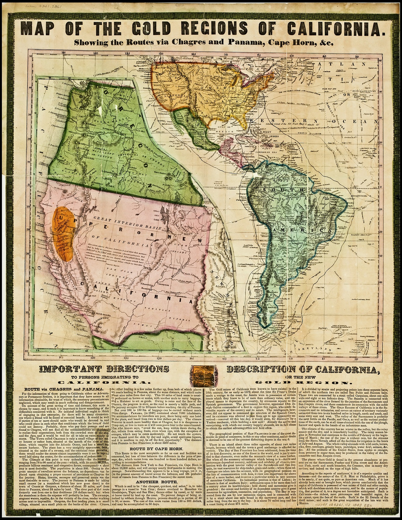
In this first pairing, we encounter two maps of California. The first map, by Thomas Jefferson Farnham and printed in 1849, is a promotional broadside, put out by Edward H. Ensign and Horace Thayer, publishers out of Buffalo, New York. In January of 1848, just months after its cession to the United States by Mexico following the US-Mexican war, California played host to a pivotal revelation. A carpenter’s discovery of gold flakes in a riverbed along the western foothills of the Sierra Nevada mountains marked a new era for migration to and within the American West. Drawn by the promise of fortune, eager men the world over flocked to California during the Gold Rush. They converted the frontier post of San Francisco into a global hub for migrants, merchants, and real estate speculators and boosted the territory’s non-Native population by a factor of eleven between 1848 and 1850. Because only difficult wagon trails crossed the vast interior of the American trans-Mississippi West in the mid-nineteenth century, many adventurers who set out from the East Coast (called Forty-Niners or Argonauts), chose from a number of maritime routes. The longest one took prospectors “around the Horn” at the Antarctic tip of South America; another would drop them at the isthmus of Panama in the Republic of New Granada to traverse the jungle by canoe and mule; another let travelers off at Veracruz to head overland across Mexico’s midsection to the Pacific. The Ensign and Thayer map gives detailed instructions regarding these routes, frames California within them, and highlights the history and promise of the new “gold region” for an interested audience.
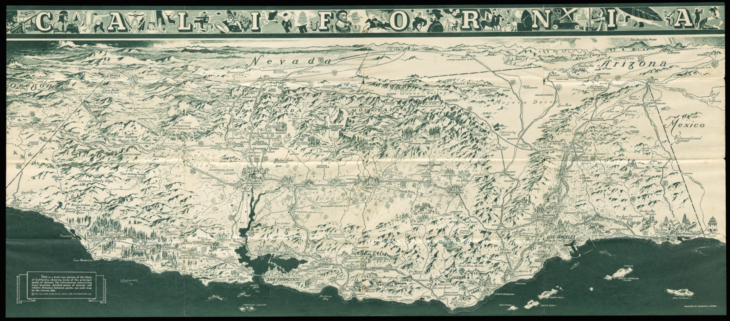
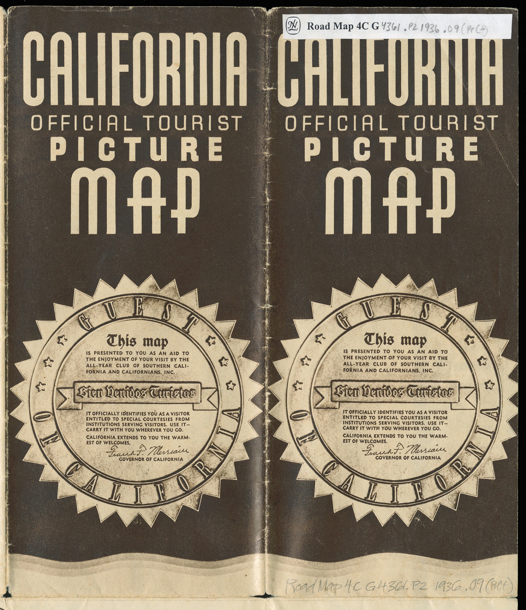
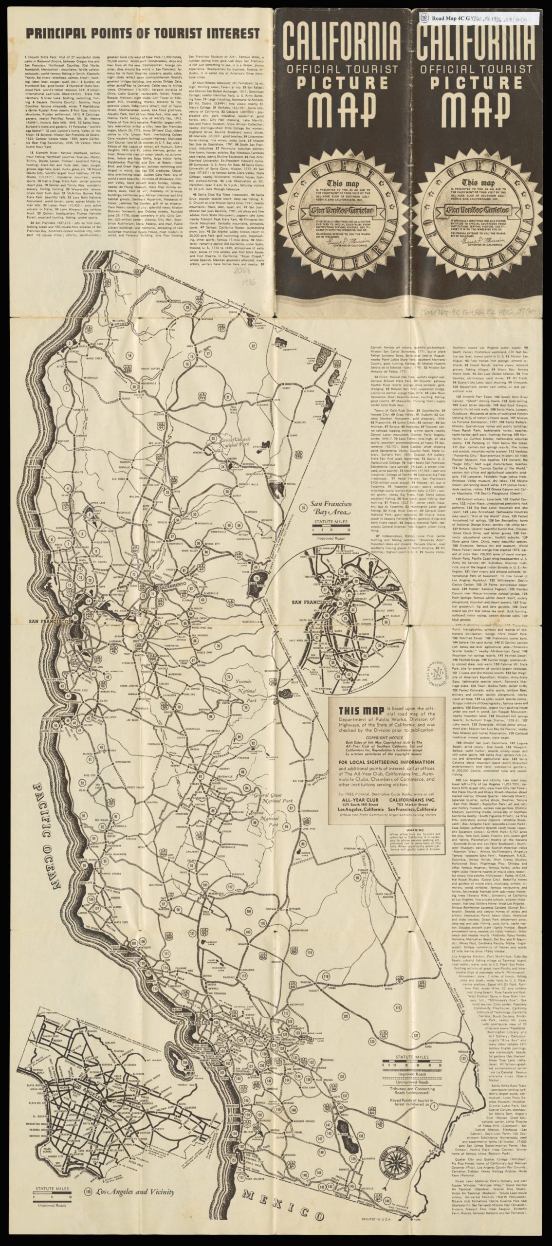
Charles H. Owens, California Official Tourist Picture Map (1936)
The second map is a promotional map of a different sort, published in 1936 by the All-Year Club of Southern California. Over the previous decade, California’s population had undergone its largest increase since the Gold Rush, driven principally by migration to its southern half, with Los Angeles bounding past San Francisco to become the largest city in California and the fifth largest in the nation by 1930. While gold brought prospectors to the Bay Area and Sacramento Valley in the mid-nineteenth century, oil, aqueducts, agriculture, and entertainment put SoCal on the map in the early twentieth century. The All-Year Club was a tireless booster organization founded in Los Angeles in 1921, dedicated to making Southern California a year-round tourist destination, rather than just a winter getaway. Maps and tourist brochures like this one were part of a well-financed publicity campaign to attract leisure-class capital to Southern California’s paradise of cool-breeze beaches, luscious orange groves, scenic Spanish Missions, picturesque mountains, and glamorous movie stars during the 1920s and 1930s. The formula worked, as the lines separating the tourist seasons blurred and the region became a residential destination for wealthy trendsetters.
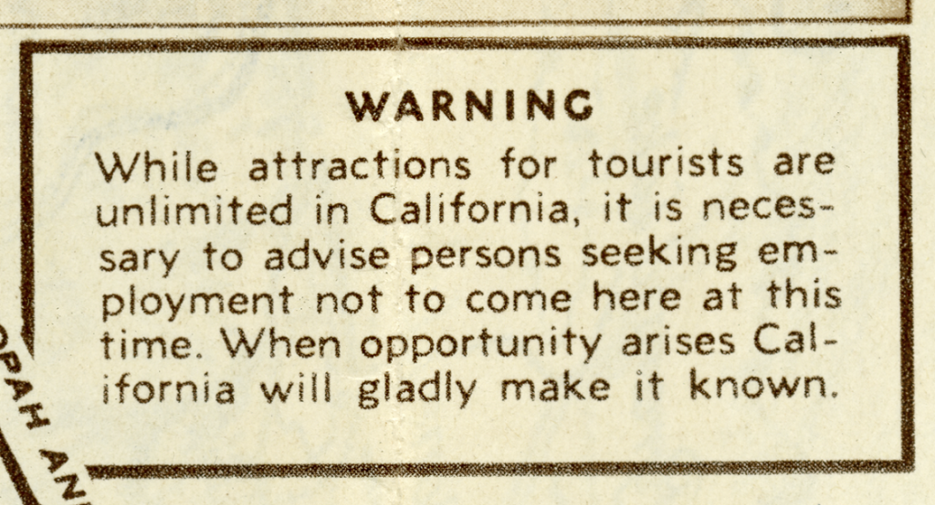
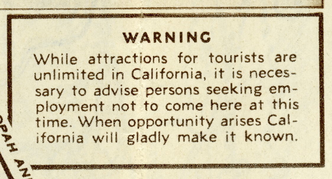
When the Great Depression hit and California relief rolls were strained, however, some worried whether groups like the All-Year Club had done too good a job at drawing newcomers. Some 300,000-400,000 migrants, displaced by the economic crisis and the ecological catastrophe of the Dust Bowl on the Southern Great Plains, arrived in California during the 1930s. Unlike the prospectors of the Gold Rush era or the posh motorists looking to spend their dollars, many of these travelers (called “Arkies” and “Okies,” due to their states of origin) were actively turned back by patrolmen at the state border. Meanwhile, Mexican immigrant workers and their American-born children were deported to Mexico in federally-supported repatriation drives. Faced with political pressure, the Club appended all of its promotional material with a clear emphasis: tourists welcome; job-seekers, try again later.
Questions to Consider:
- Compare the way that California’s history is presented in the two maps. How do Ensign and Thayer portray California’s past, present, and future in their text about the “new gold region”? What imagery does the All-Year Club use to create a sense of regional heritage for California aimed at tourists?
- Compare the two maps’ overall visual approach. What regional or global contexts do the cartographers and artists put around California? What choices of orientation and perspective do they play with to create their picture? How do these choices sell California differently for different audiences in different historical moments?
- Compare the two maps’ visual approach to California itself. What physical features, travel routes, markers, and points of interest do the cartographers and artists put within California? How do these choices sell California differently for different audiences in different historical moments?
- Both of these maps are promotional and have an intended audience. Try to create a picture of the type of person who is being targeted by each map. Who is this person, and what do you think their interests and priorities are?
- Does knowing a map was designed as an advertisement change how you read it? How?
In Whose Footsteps?
In this second set of maps, we get three renderings of a single general area, spanning the Northern Great Plains, between the Mississippi River and the Columbia Plateau. In the early nineteenth century, this vast territory was part of the continental-sized parcel known as the Louisiana Purchase, bought by the United States from France in 1803. The Corps of Discovery, commissioned by President Thomas Jefferson and led by two Virginia military men, Merriwether Lewis and William Clark, set out to survey and report on the shape, substance, and economic potential of the territory that had been bought. Over a two-and-a-half-year expedition that took them across the high plains by way of the Missouri River, over the Rockies, down the Columbia River to the Pacific Coast and back again, the Corps assembled meticulous accounts and renderings of the flora, fauna, landforms, and peoples of the new American territory. Mapping the land and waterways they navigated was a primary objective of their commission.
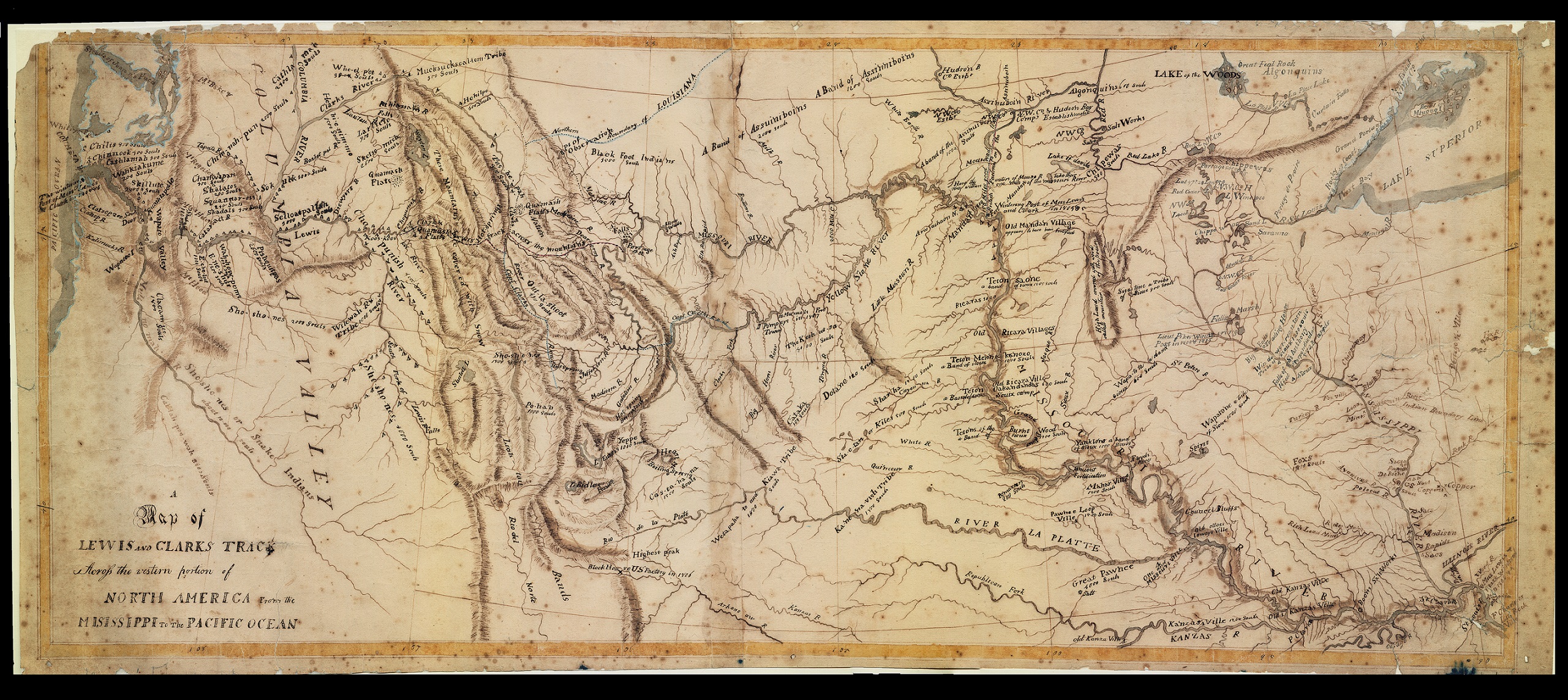
Trained extensively by Jefferson and master surveyor Andrew Ellicott before they departed, Lewis and Clark created detailed maps on gridded field sheets for every day’s worth of their journey, determining their latitude and longitude with an octant (a device to measure the angles of celestial bodies) and a chronometer (an expensive watch to fix local time). They then recorded their direction and distance with the aid of a compass, a surveyor’s chain, and their best estimates of distances traversed. As they traveled further westward, the Corps’ success at navigation and survival depended upon their frequent encounters and engagements with Native peoples along the way. The base of information they used to assemble their maps expanded to include the verbal and graphic sketches offered to them by countless Indigenous informants, each with their own complex language and forms of spatial representation.
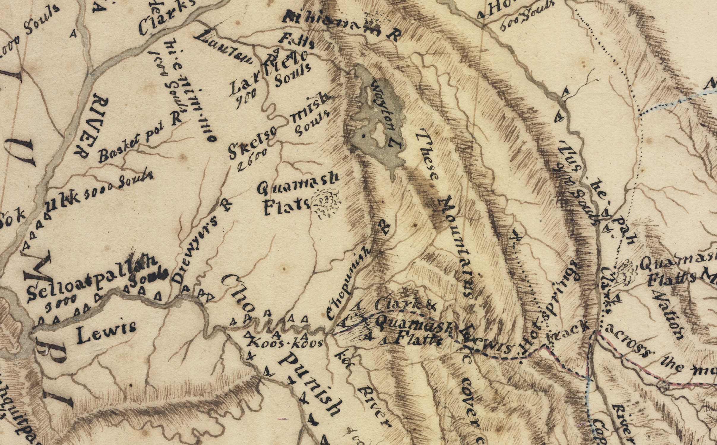
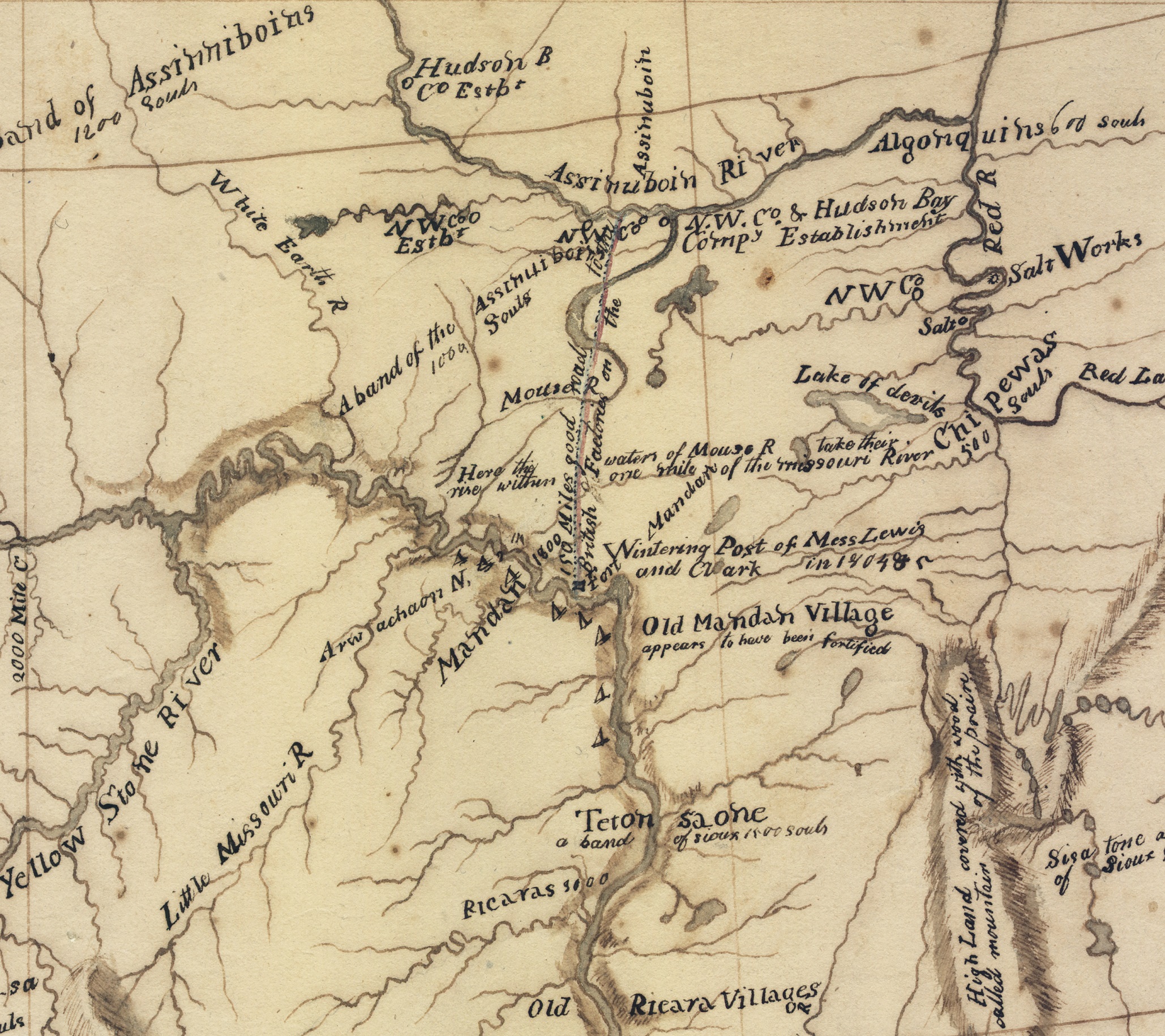
William Clark, et al. A Map of Lewis and Clark’s Track Across the Western Portion of North America from the Misissippi [sic] to the Pacific Ocean, details (1811)
Upon the Corps’ return to the East in 1806, Clark took on the job of creating composite maps of the entire American West, combining their daily traverse maps with the copies they had drawn of Native maps about the broader surroundings. By the time Clark had finished his most comprehensive version in 1811 (the first map and details presented here), the prominent Philadelphia editor, lawyer, and intellectual Nicholas Biddle was busy composing an authorized narrative history of the expedition. Biddle gave Clark’s prototype map to the accomplished cartographer Samuel Lewis to copy, finalizing a full-blown picture of the ground covered by the Corps of Discovery, which was then reproduced and included in the published history.
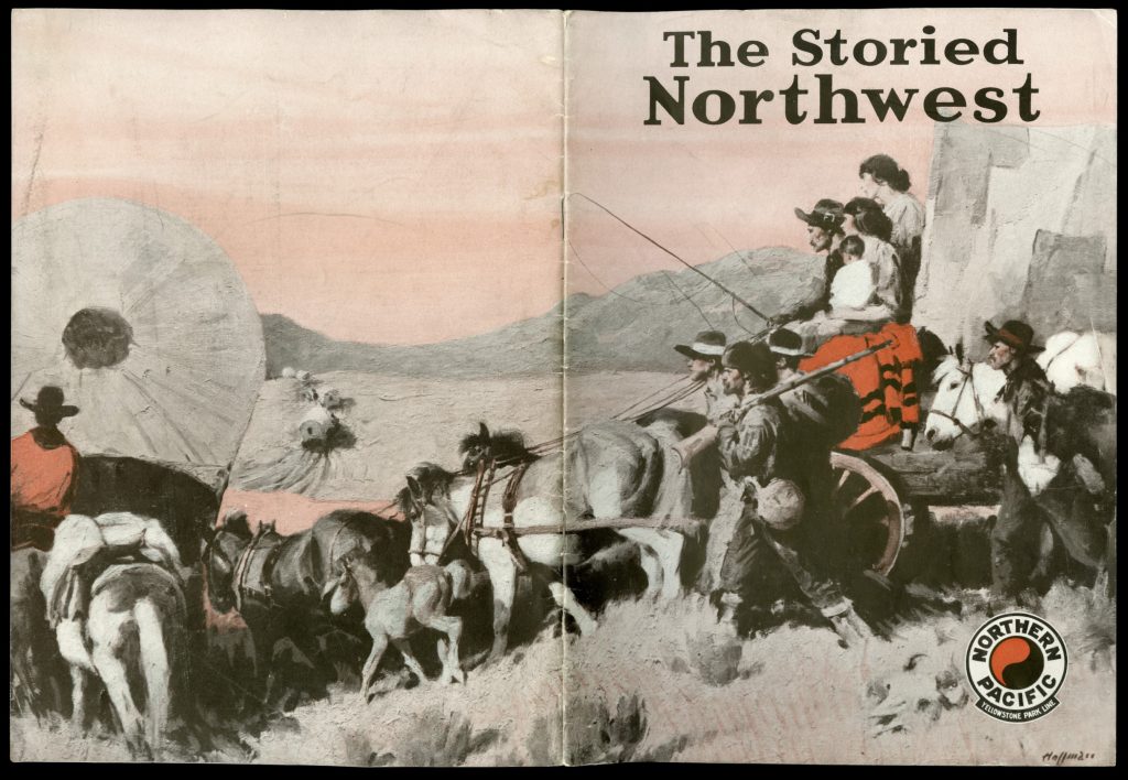
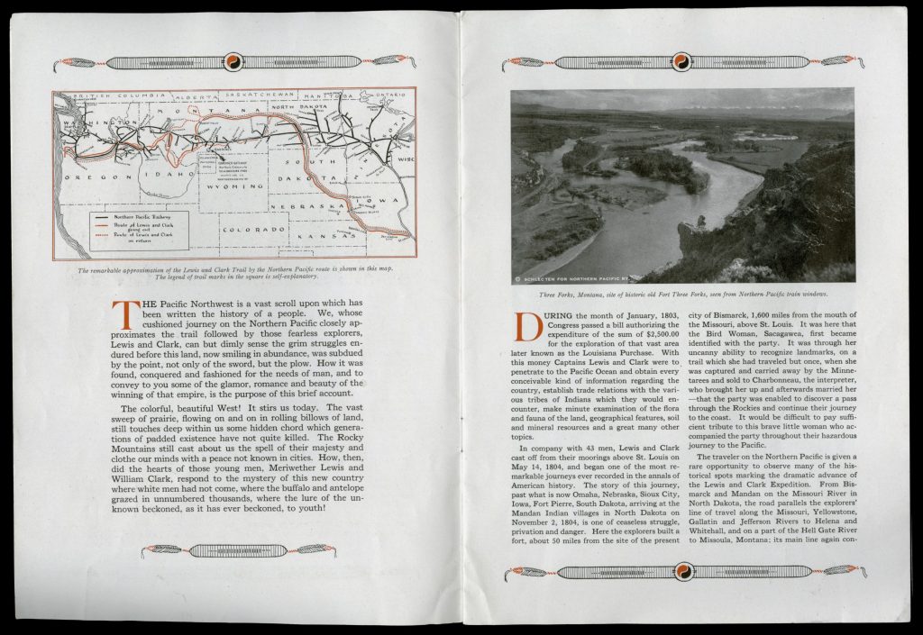
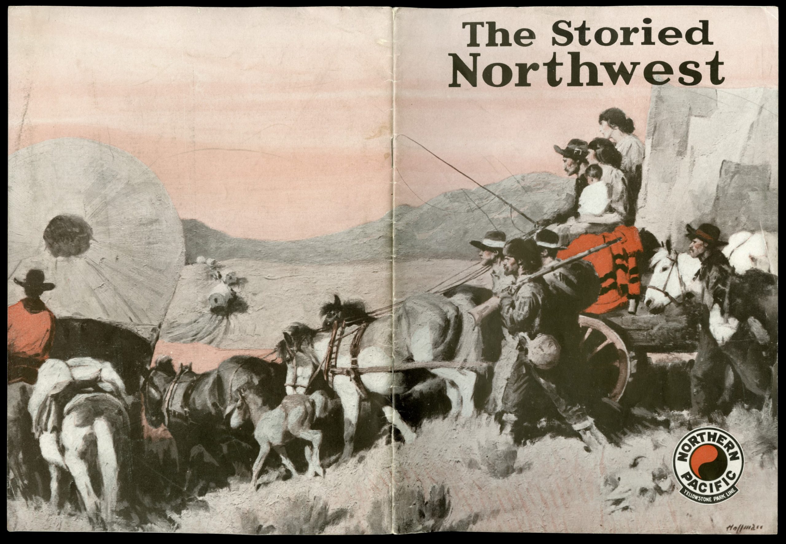
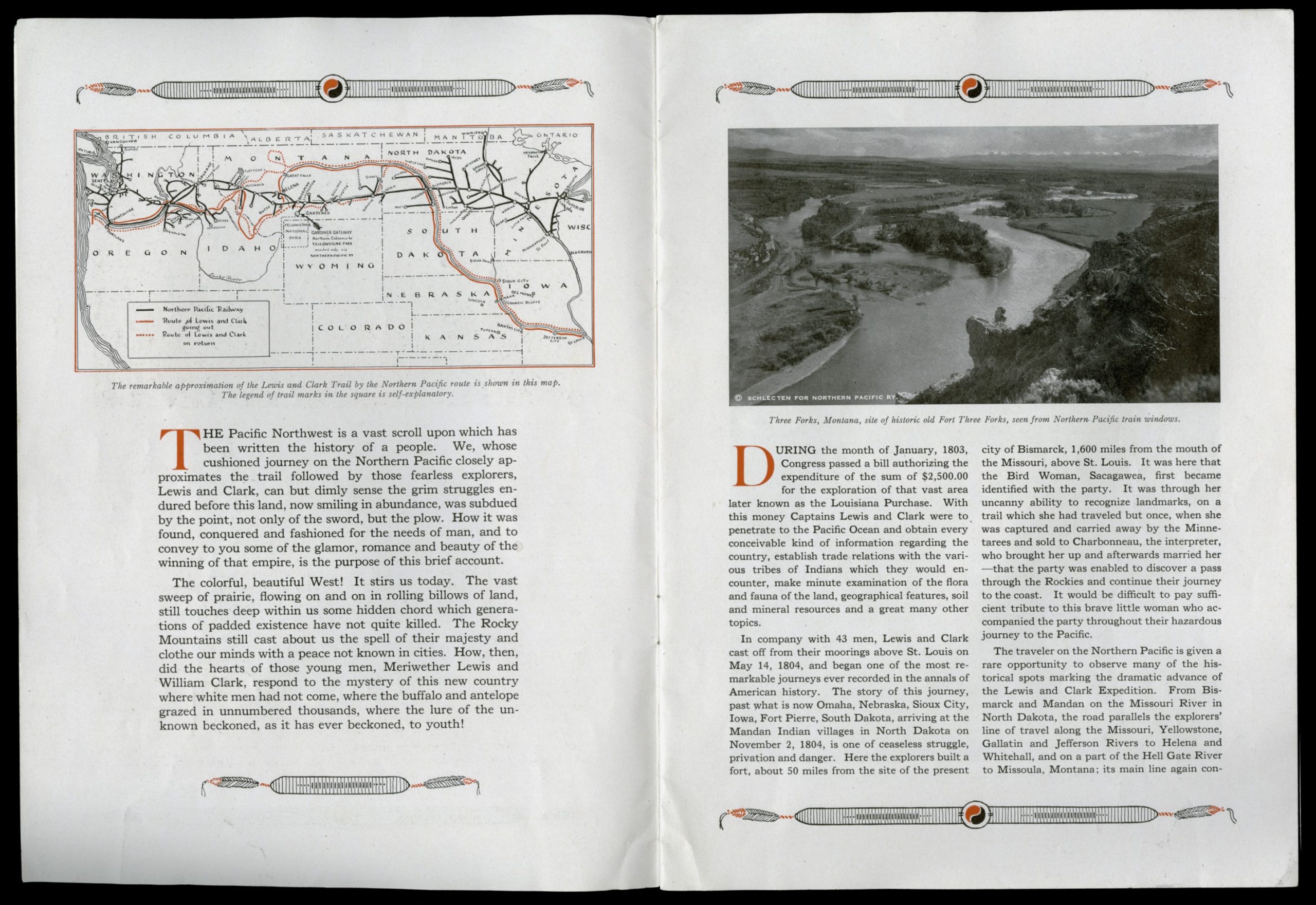
Northern Pacific Railroad, The Storied Northwest (1925)
The second map presented here comes from a tourist brochure, published in 1925 by the Northern Pacific Railroad Company. Only crossed by rail after the 1880s, the Northern Plains and Pacific Northwest remained sparsely settled and rarely toured by travelers well into the twentieth century. Railroad companies hoping to draw more tourism to their routes commissioned promotional pamphlets, highlighting the natural beauty and national parks of the Mountain West. In this brochure, the copywriters hired by Northern Pacific also staged a dramatic contrast between the comforts of a modern railroad trip and the rugged heritage of the Lewis and Clark expedition. By the early decades of the twentieth century, Americans had a heightened popular sense of Lewis and Clark as national heroes, aided by the publications and commemorations that surrounded the centennial of their expedition. In addition to noting that a ride on the Northern Pacific provides occasion for visiting historical site markers related to Lewis and Clark, the brochure makes a romantic appeal to railroad passengers, urging them to spiritually connect their own sense of wonder and curiosity as tourists to the mission of exploration that the Corps of Discovery embodied. The landscapes to be enjoyed out of the railway car picture windows are framed as preserved artifacts of an unconquered West, understood to be much the same as Lewis and Clark would have encountered them over a century before.

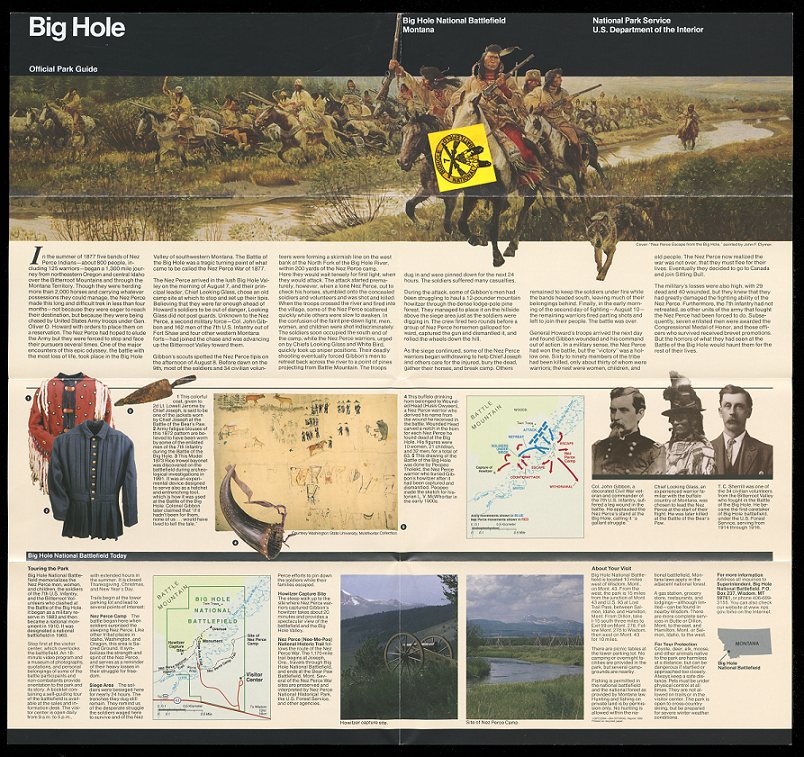
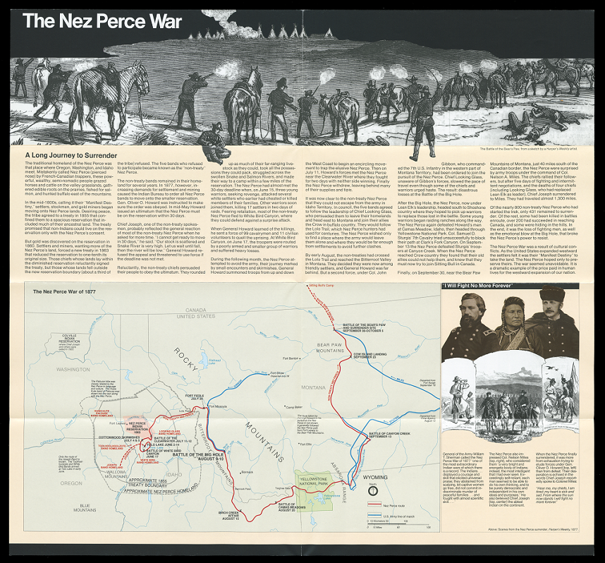
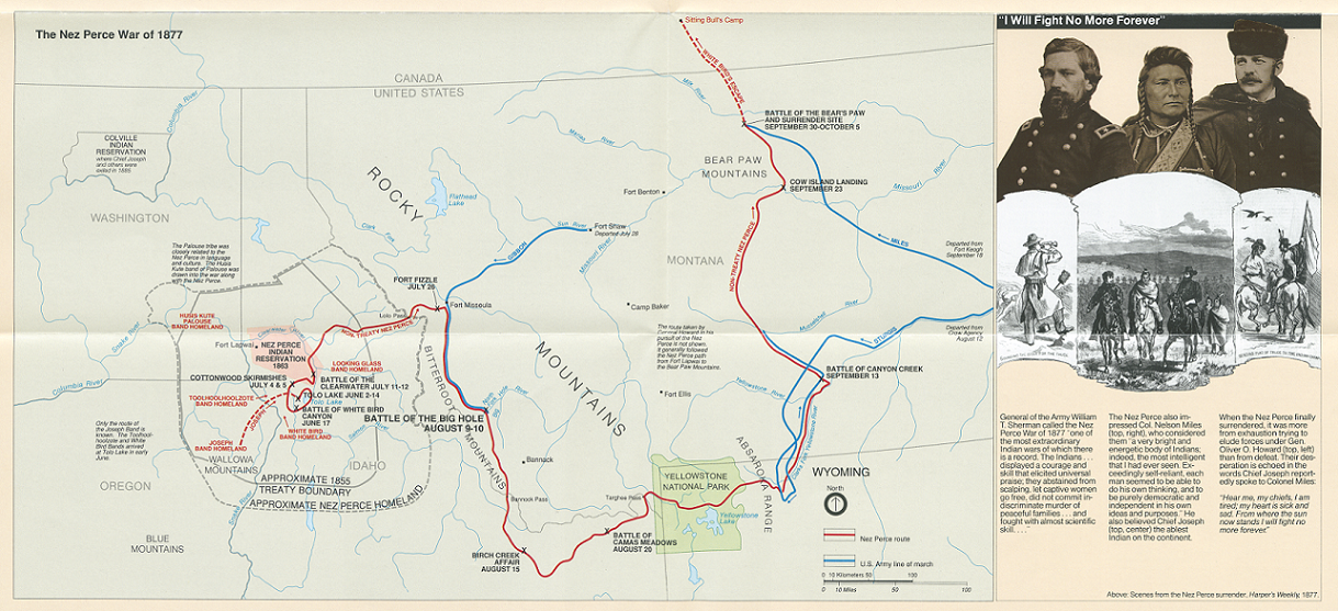
The third map shows a distinctive change in the way that tourism in the American West portrayed Native peoples and the military history of US-Indigenous warfare in the nineteenth century. Accounts like that found in the railroad brochure of the early twentieth century either celebrated or minimized the American subjugation of the Plains peoples in favor of rosy portrayals of natural beauty. By the late twentieth century, frontier myths remained popular, but the Civil Rights revolution had transformed general and professional knowledge about the American past. Advocacy by groups in the American Indian Movement and the growth in scholarship on Native history contributed to a shift in public understandings of the nation’s multicultural character and promoted the incorporation of exclusion, slavery, and conquest within the American story. The National Park Service was an early adopter of these intellectual shifts. It designated the Nez Perce National Historical Park (NPHP) in 1965, ratifying a joint effort by the Nez Perce Tribe and the State of Idaho. The NPHP has expanded to include thirty-eight sites across four states, as well as a thousand-mile trail commemorating sites in the Nez Perce war of 1877, in which a band of Nez Perce (nimi-pu) battled the US Army as they resisted their forced relocation and attempted to flee to Canada before surrendering just shy of their destination. The map, provided as part of the 2004 Official Park Guide for tourists entering the Big Hole National Battlefield in western Montana, puts a new emphasis on the region’s historical significance. In place of the westward acquisition and exploration stressed in accounts inspired by the Lewis and Clark expedition (which had its bicentennial commemorated that year), the map shows the region as a zone of war and flight, and casts the Nez Perce as agents of military struggle against American power.
National Parks Service, “Big Hole Official Park Guide” (2004)
Questions to Condisder:
- How do renderings of the same space differ on maps used to announce an accomplishment (as in the 1811 map) as opposed to those drawn to attract travel (as in the 1925 map) or to instruct (as in the 2004 map)?
- Why do you think Native peoples and wars between the US and Indigenous groups were not mentioned or depicted in the Northern Pacific Railroad’s promotional brochure?
- What does the 2004 park map suggest about travelers’ motives and interests for visiting the American West? Which of these seem unique to the turn of the twenty-first century, and which seem continuous with older patterns of tourism?
Antebellum Remembrances
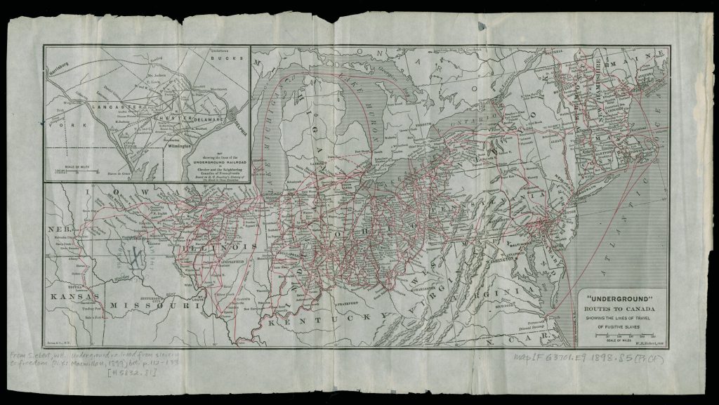
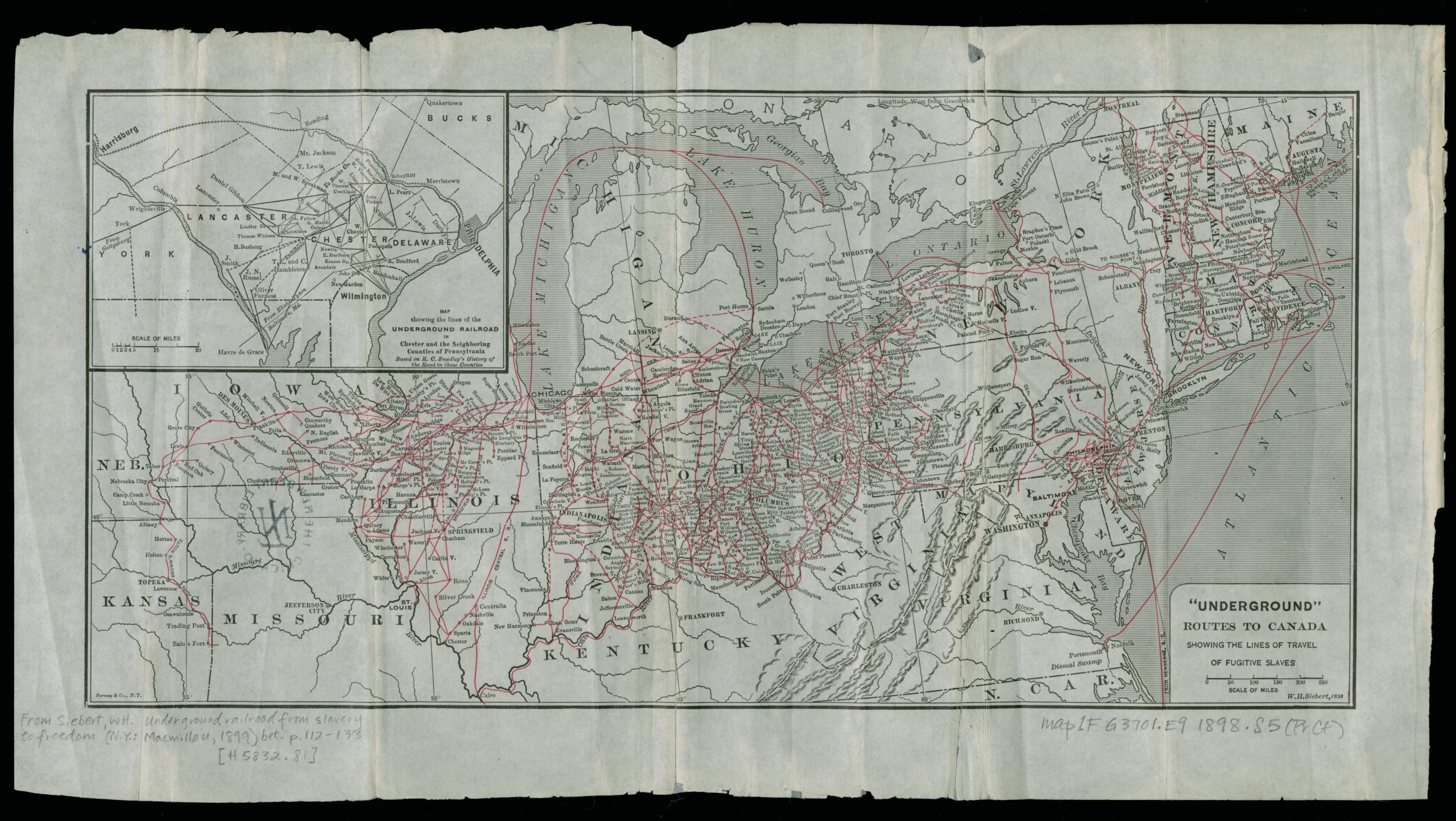
In this third group, we see three maps about the American South during the era of slavery made at three distinct moments. All deploy some form of collective memory or individual recollection to tell a story about the era. The first is a map created by the historian Wilbur Siebert of the Ohio State University in 1898. Frustrated by what he called the “circumscribed and local character” of extant histories of the Underground Railroad (the network of secret routes and waystations used by escaped slaves to pursue freedom before the Civil War), Siebert spent four years collecting papers and interviews from the relatives and descendants of antislavery activists who had worked to maintain the network during the years leading up the Civil War. Out of this research, he produced The Underground Railroad: from Slavery to Freedom, a book heralded by scholars at the turn of the twentieth century for its breakthrough fusion of interview and cartography to render visible the continental-scale “system” of routes curated by fugitive slaves and their accomplices.
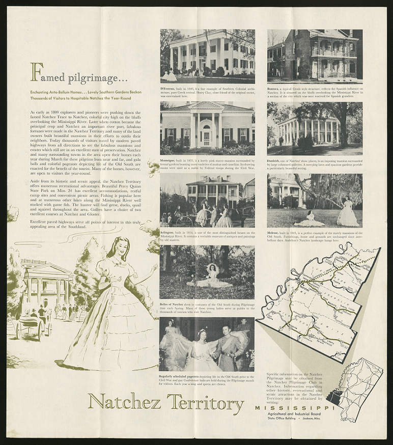
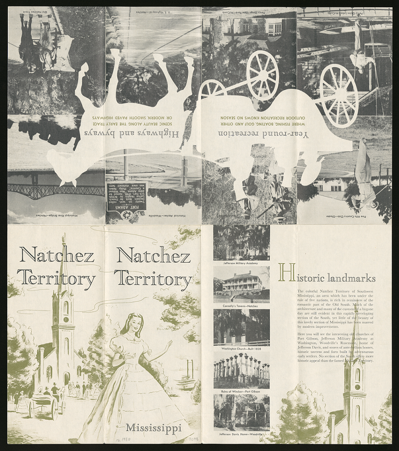
The second map originates from the 1950s, when groups like the Mississippi Agricultural and Industrial Board (MAIB) funded the production of publicity materials to attract new manufacturing and agribusiness enterprises to the Magnolia State, which was among the poorest and least industrialized states in the union. In regional promotional pamphlets like this one focused on the river city of Natchez, the MAIB aimed their message at vacationing motorists of means, stressing the combination of antebellum charm, middle-class leisure, and the convenience of the interstate highway system. As the map indicates, Natchez’s promoters in the MAIB assumed that the city’s cultural cachet was best linked to the history of its slave owning classes – their mansions, pageants, and costumes – rather than that of those descended from slaves, who comprised the majority of the county’s population.
Mississippi Agricultural and Industrial Board, Natchez Territory (c. 1950)
The third map, designed by graphic designer and architect Karen Lewis, was commissioned by the Newberry Library in 2021 as part of its Crossings exhibition. With a stated purpose of reconstructing the experience of the Underground Railroad from the perspective of those who tried to escape slavery, Lewis combined the accounts of enslaved people, as collected in oral histories, with Geographic Information System (GIS) data to create a digital visualization of several individual escapes, as well as a region-wide rendering of routes as in Siebert. The focus on individual narratives creates intimate scales of mapping, with barns, paths, and riverbanks rendered in close-to-the ground visualizations.
Questions to Consider:
- What do you think historians, studying US history at the time the Siebert map was produced in 1898, would notice or find striking? In what way might Siebert’s map have challenged or complicated popular images of slavery and the antebellum South in the 1890s?
- Why would boosters of local industrial and economic development assume that the legacies of plantation slavery might serve as a driver for tourism? How might designers of a publicity pamphlet for Natchez, Mississippi in the twenty-first century change their pitch? What might remain the same?
- How does the Lewis map of 2004 differ in purpose and emphasis from the Siebert map of 1898? What do these differences tell us about the distinct historical contexts driving popular and academic interest in slavery and the Underground Railroad?
- How does digital visualization and first-hand narrative change the experience of reading a map? What other historical events or experiences might lend themselves to the type of graphic design approach presented in Lewis’ exhibit?
About the Author
Nicholas Kryczka is a Research Coordinator with the American Historical Association. He earned his PhD in History at the University of Chicago, where he taught coursework in American civilization, urban history, and oral history. His research focuses on the history of post-civil rights school reform in Chicago. Previously, Nick worked for a decade as a high school social studies teacher in the Chicago Public Schools.


Further Reading
Ehrenberg, Ralph E.The Mapping of America. New York: Harry N. Abrams, Inc, 1980.
Gish, Todd. Growing and Selling Los Angeles: The All-Year Club of Southern California, 1921-194, Southern California Quarterly, vol. 89, no. 4 (Winter 2007-2008), 391-415.
Linnenthal, Edward. Sacred Ground: Americans and Their Battlefields. Urbana: University of Illinois Press, 1991.
Siebert, Wilbur H. The Underground Railroad from Slavery to Freedom: A Comprehensive History. The Macmillan Company, New York and London,1898.


