


Curriculum Connections: Geography, Maps, Visual Literacy
Materials – Available for Download in the Downloads Tab:
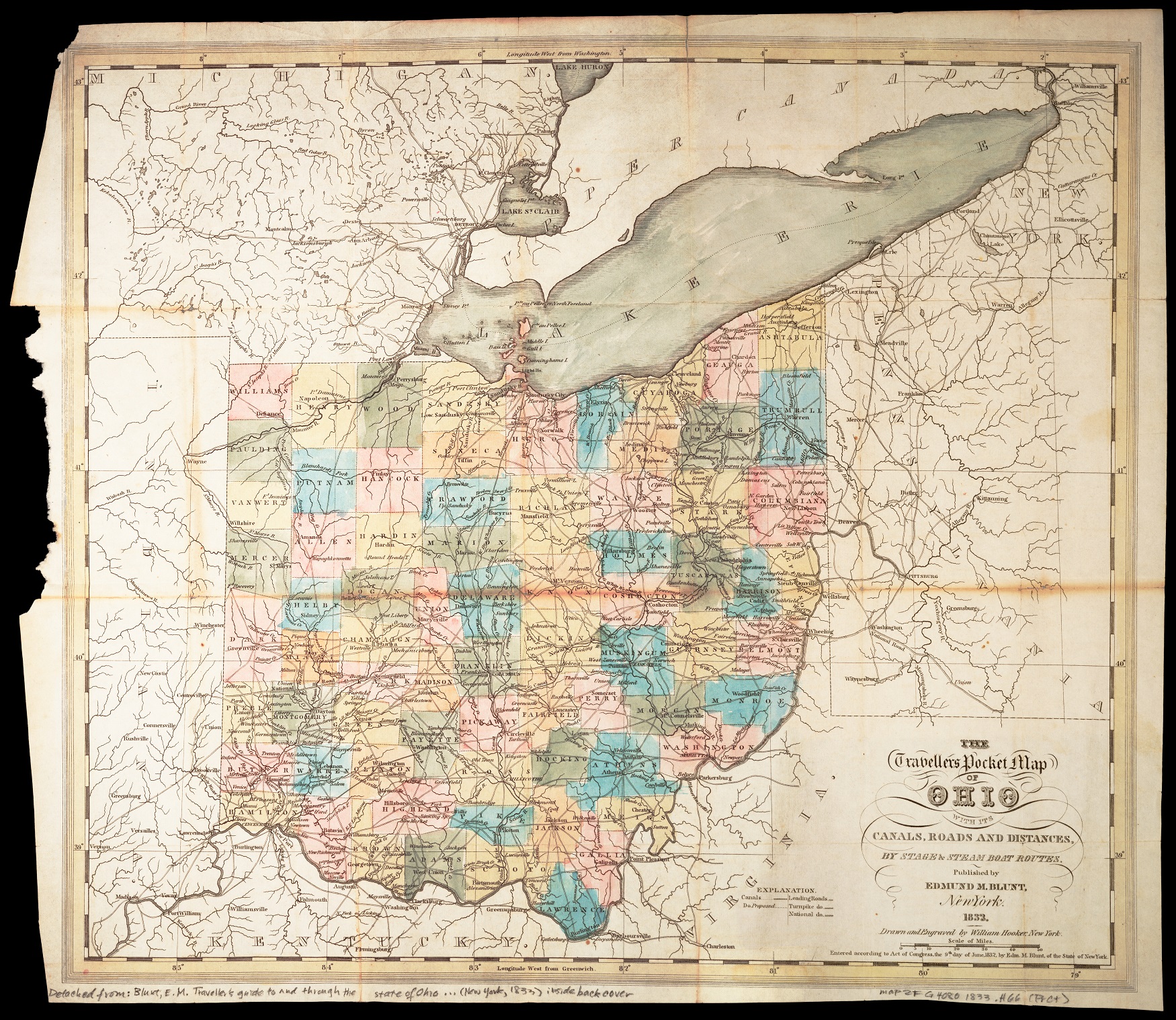
Look at the map “The Travellers Pocket Map of Ohio.”
Without looking too closely, you can probably understand that the colors are helping you see the state’s counties. You can also recognize a light coloring to show the water in Lake Erie. But what about all the different lines in the map?
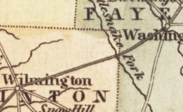
When you look at a detail of part of Ohio, it can seem like a confusing mess of lines with different designs, different weights, and different patterns. By untangling all these different kinds of lines, we can understand how this map works and, in turn, how its elements work together to tell a story about Ohio.
First, let’s identify the different kinds of lines on the map:
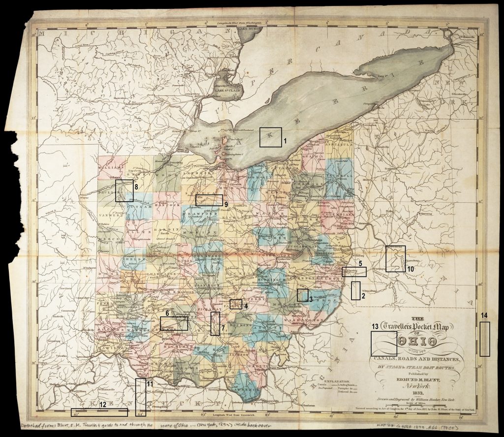
That’s a lot of different lines!
To understand how they all work, we can start to categorize them by function.
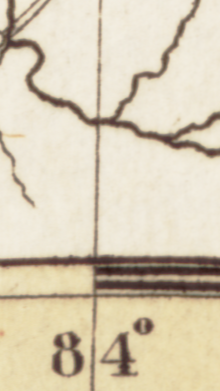
The first three types of lines in the list show political boundaries, between the US and Canada, between US states, and between counties in Ohio.
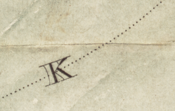

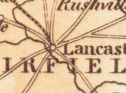
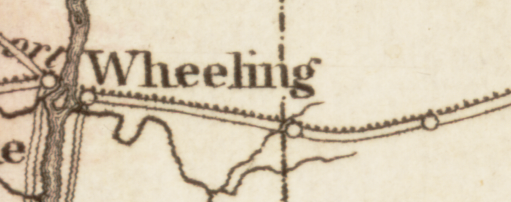
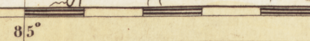
The different kinds of double lines throughout Ohio seem to connect different places. Because of that observation, we might infer that they are roads. But what kind? Knowing we might be confused, the mapmaker has provided a legend! The legend explains that three types of double lines are different sizes of roads. The other double line shows canals. The abbreviation “do” here stands for “ditto,” a term which indicates that a word or figure is repeated in a list.
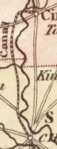
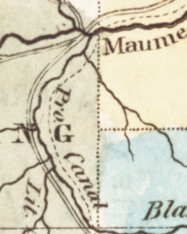
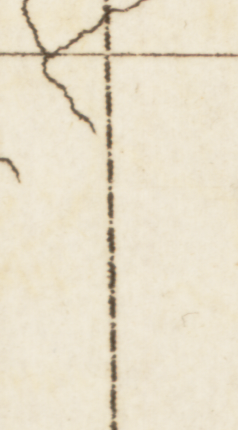
And this particular dotted line (#8) shows canals that have been proposed but not yet built. In fact, with one example of this line on the map, we can also see that it is labeled proposed canal (abbreviated “pro canal”).
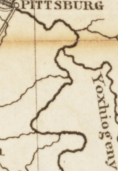
Although they are not identified in the legend, the squiggly lines throughout the map have labels that identify them as water systems, with abbreviations like Cr. for creek, and R. for river.
![Detail of a map showing a dark squiggly line representing a river. The line is marked "Honey Cr. [Creek]."](https://dcc.newberry.org/wp-content/uploads/2023/09/Image9_River.png)
Criss-crossing the entire map are solid lines that emanate from numbers along the edges. Sometimes these lines disappear and reappear. These lines make the grid of longitude and latitude, which give a mathematical basis to locations on the map. Likewise, the double lines with alternating black and white sections can help us follow fraction of degrees between the lines of longitude and latitude along all the map’s edges.
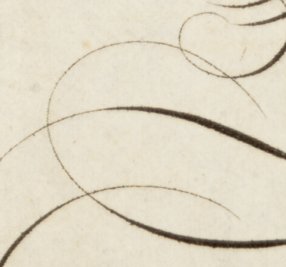
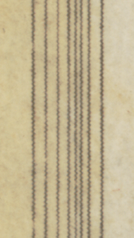
These lines do not communicate any particular information. They instead add style to the map. The loops and curls around the title and the border of nine lines around the very edge of the map draw our eyes to the action of the map and add depth to the image.
Looking carefully at how different kinds of lines work on this map helps us understand the complexity that goes into designing and reading maps. It can be easy to see a map like this as a simple document that just shows things as they are. But, in fact, it is full of choices that the mapmakers have made to prioritize certain features of this landscape and to downplay others. These choices make some things easy to find and other things hard to see; in other cases, some are totally absent.
As you analyze a map and start to piece together how all the different elements of the map are working together?, you will be able to make your own arguments about how and why a map is telling its story. Consider, for instance, the following questions:
Using this map as an example, try decoding the lines on these maps yourself:
Ditto | word used in lists to indicate that a word or figure repeats
Legend | a table on the side of a map that explains the meanings of symbols used in the map
Explore the lines in “The Traveller’s Pocket Map of Ohio” below.
Download the following materials below: