


Curriculum Connections: Geography, Maps, Visual Literacy
Materials – Available for Download in the Downloads Tab:
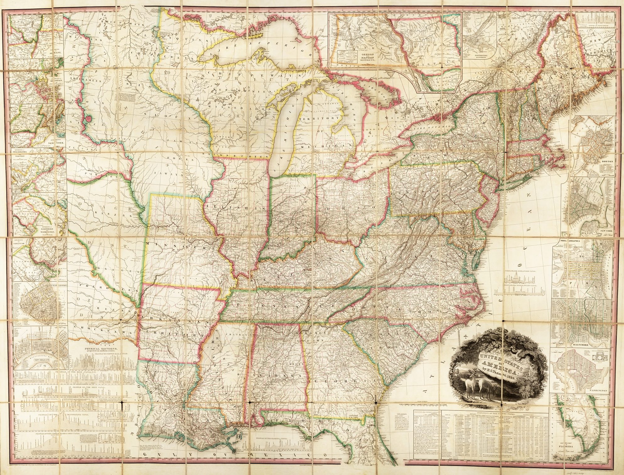
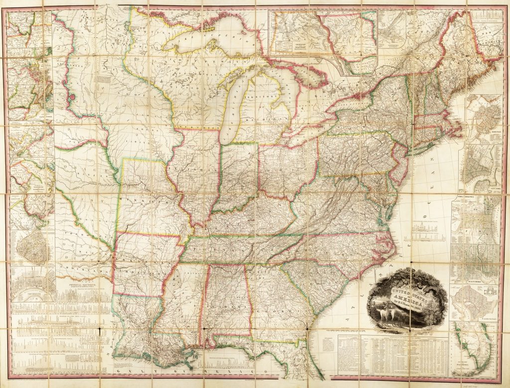
Maps bring together many different people and many different fields of expertise. An eighteenth-century map required a printer, engraver, surveyors, a cartographer, and a colorist who were using mathematics, art, older maps and symbols, previous atlases, and written accounts of travel. Because of this wide range of people and sources of information, maps have many different elements that work to tell a story about the places they depict. Below is one list of elements on one nineteenth-century map of the United States.
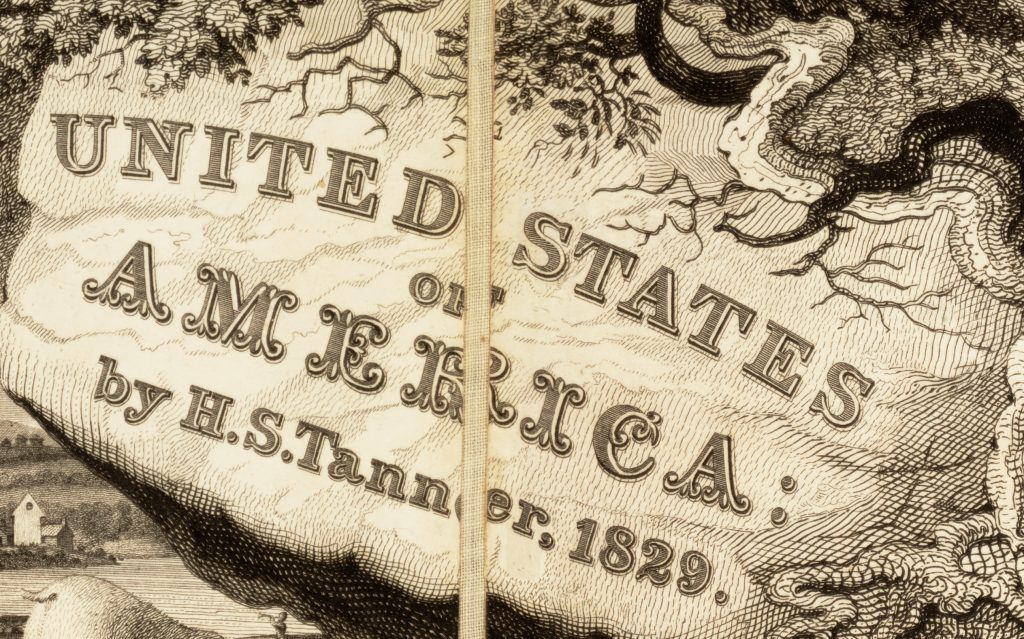
Title: The title of the map is its most prominent name. It usually appears in the biggest lettering and often in a decorative space on the map called a cartouche. “United States of America” may seem like too broad a name for this map, but remember, in 1839 there were no official states west of Missouri, Arkansas, and Louisiana.
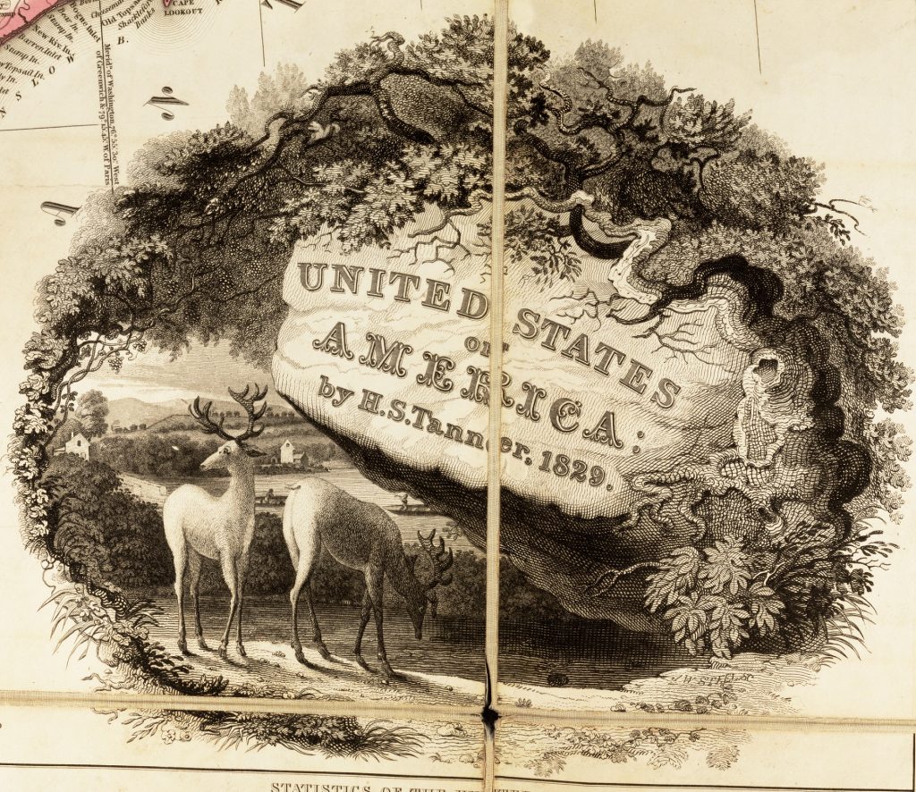
Cartouche: A cartouche is an elaborate decorative piece of the map that usually combines the main information about the map, such as author, date, and title, with a symbolic representation. This image tells us something about the message the mapmaker is trying to communicate. For instance, the deer grazing in front of farmland surrounded by a forested border characterizes the US as a land of ample resources.
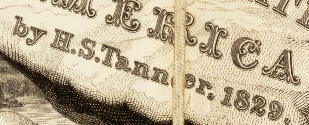
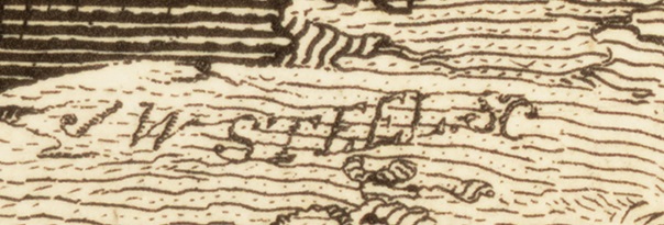
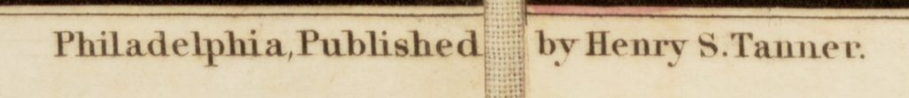
Author: The name of the main author or publisher will often appear near the title, as H. S. Tanner’s name does here. But very few maps were the work of only a single person. Maps like this one relied on a mapmaker as well as printers and engravers who made the printing plate (or parts of the plate). These other names often appear at the base of the map or near specific elements. In the cartouche, you can see the signature “J. W. Steel, sc.” Sc is an abbreviation for sculpsit, Latin for “he/she engraved this.” In the lower right, you can see three other names, H. S. Tanner again but also W. Allen and J. Knight. Henry S. Tanner appears again as publisher in the lower middle of the map.

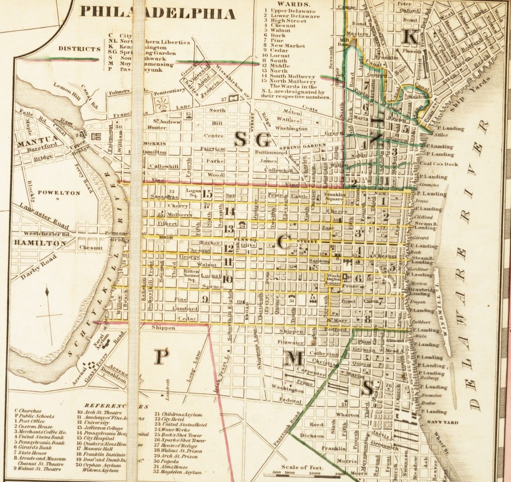
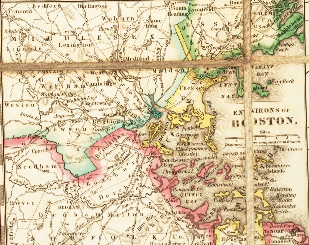
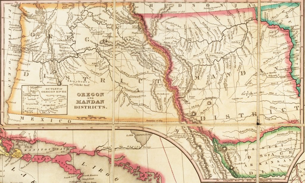
Inset: When we talk about “a map” we can often actually mean a set of maps of different sizes all on one piece of paper. The largest map here shows the states and territories of the US in 1839. But surrounding the map on all sides are inset maps (often just called insets). Insets show information at a different resolution than the largest map. For instance, this map includes more detailed maps of individual cities like Philadelphia, of regions like the “environs of Boston,” and of large areas like “Oregon and Mandan Districts.” Notice how there is even an inset in this last inset!
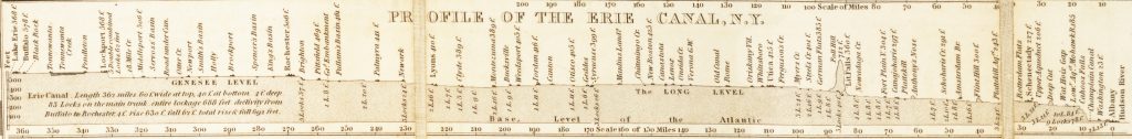
Profiles: Like insets, profiles can appear within or alongside a map. They show areas in cross-section to illustrate differences in altitude or the make-up of geological features. Here, the profiles focus on feats of engineering such as railroads and canals.
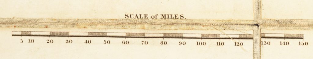
Scale: Maps can, but not always, have an explicit scale to them. The scale is a mathematical ratio of distances on the map to distances on the surface of the earth. Maps often communicate this ratio using a scale bar, which shows a length on the map and tells you how far that is on the earth in miles, feet, or some other unit of distance. By using different scales, this map can have insets that are the same size on the map even though they represent areas of very different sizes.
Latitude and Longitude: Like the map’s scales, longitude and latitude provide mathematical structure. Longitude and Latitude translate a grid on the globe to a system of lines on a map based on the 360 degrees in a circle. These lines connect the same number across opposite sides of the map. Longitude and Latitude make comparing positions on a map and between maps much easier. Older maps will usually explicitly state where they are placing degree zero. Emphasizing its focus on the US, this map chooses Washington D. C. as its origin point.

Neatline: The neatline is the boundary of the content of the map. Although as this map demonstrates, the neatline can be anything but neat! At several points, this map breaks the neatline to squeeze in more information without having to shrink the rest of the information on the map.
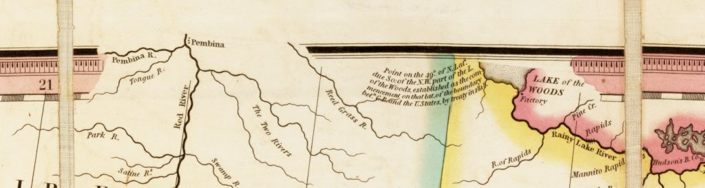
Toponyms: Place names on a map are called toponyms (from the Greek words for “place” and “name”). Toponyms on maps can range in size, orientation, and style. Often, bigger letters will refer to larger or more prominent areas. Letters will also sometimes follow the course of the feature they are naming. Consistency in the style of lettering can help you understand quickly what you are seeing. This map, for instance, uses slanted italic lettering for rivers and large bold lettering for state names.
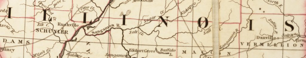
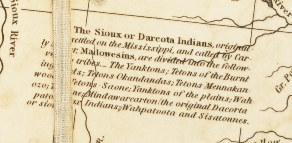
Content: The content of a map can range widely and come in many forms. This map, for example, uses lines of color to show political boundaries, different kinds of lines to depict roads and rivers, and sections of text to provide more precise details.
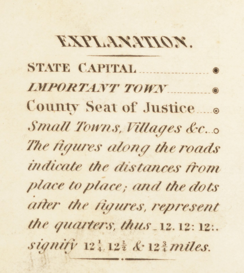
Legend: The legend explains symbols or features on the map. This map’s legend helps us understand the symbols that describe kinds of settlements as well as distances along roads.

North Arrow: North is at the top, right? Well, not always. Having North at the top of a map is a dominant convention in European and American maps. Arrows drawn on the map are there to help orient you about where North is. In the inset of Boston, for instance, the arrow drifting to the upper right lets us know that North is not directly at the top of that inset.
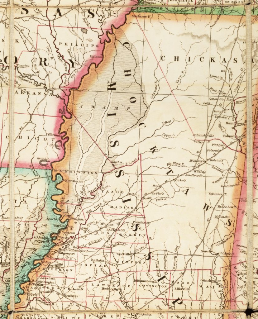
Dissection: A map that has been dissected and backed on linen refers to a map like this that has been purposefully cut into pieces and then glued to a stronger piece of fabric. Dissecting a map was a common practice in the nineteenth century because it allowed people to fold and refold a map many times without having to worry about the map ripping into separate pieces. This map would easily fold into the size of one of these rectangles. The cross-hatched pattern in the gaps is the pattern of the supporting fabric.
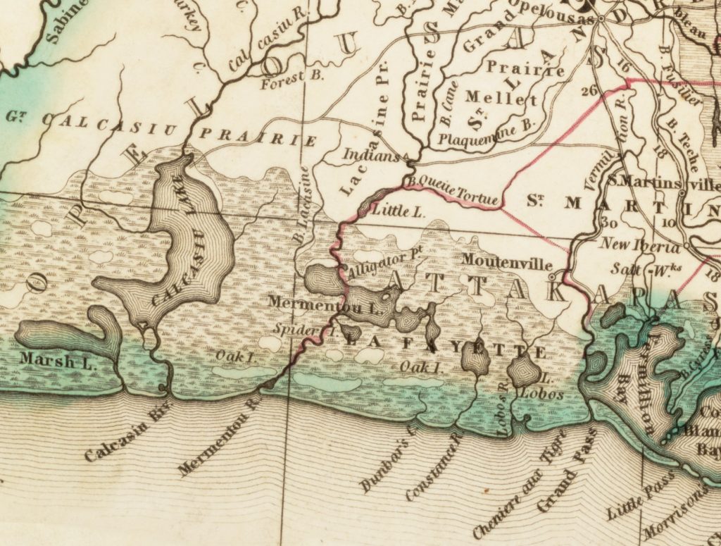
Topography: Topography refers to the representation of different types of land and environment on the map. This map, for instance, uses different symbols to show swamps, mountains, and lakes, which are all part of the map’s topography.
In analyzing a map, you should consider how these elements, and other elements we haven’t named, combine to tell a specific story. You should also ask why the map includes certain information and excludes other information. For instance, consider the following questions:
Walk through this map of the United States below.
Download the following materials below: