

Themes
Chicago History
Immigration
Industrialization
Periods
Progressive Era
Skills & Document Types
Charts & Graphs
Visual Literacy
This classroom activity and the accompanying Collection Essay were produced through a generous annual fellowship for digital education on American Women’s History or Early American History funded by the Chicago Chapter, National Society Daughters of the American Revolution, 2023.
Materials – Available for Download in the Downloads Tab:
This activity is a way to provide a lesson on visual literacy within a history curriculum, as well as an introduction to or exploration of interpreting statistics.
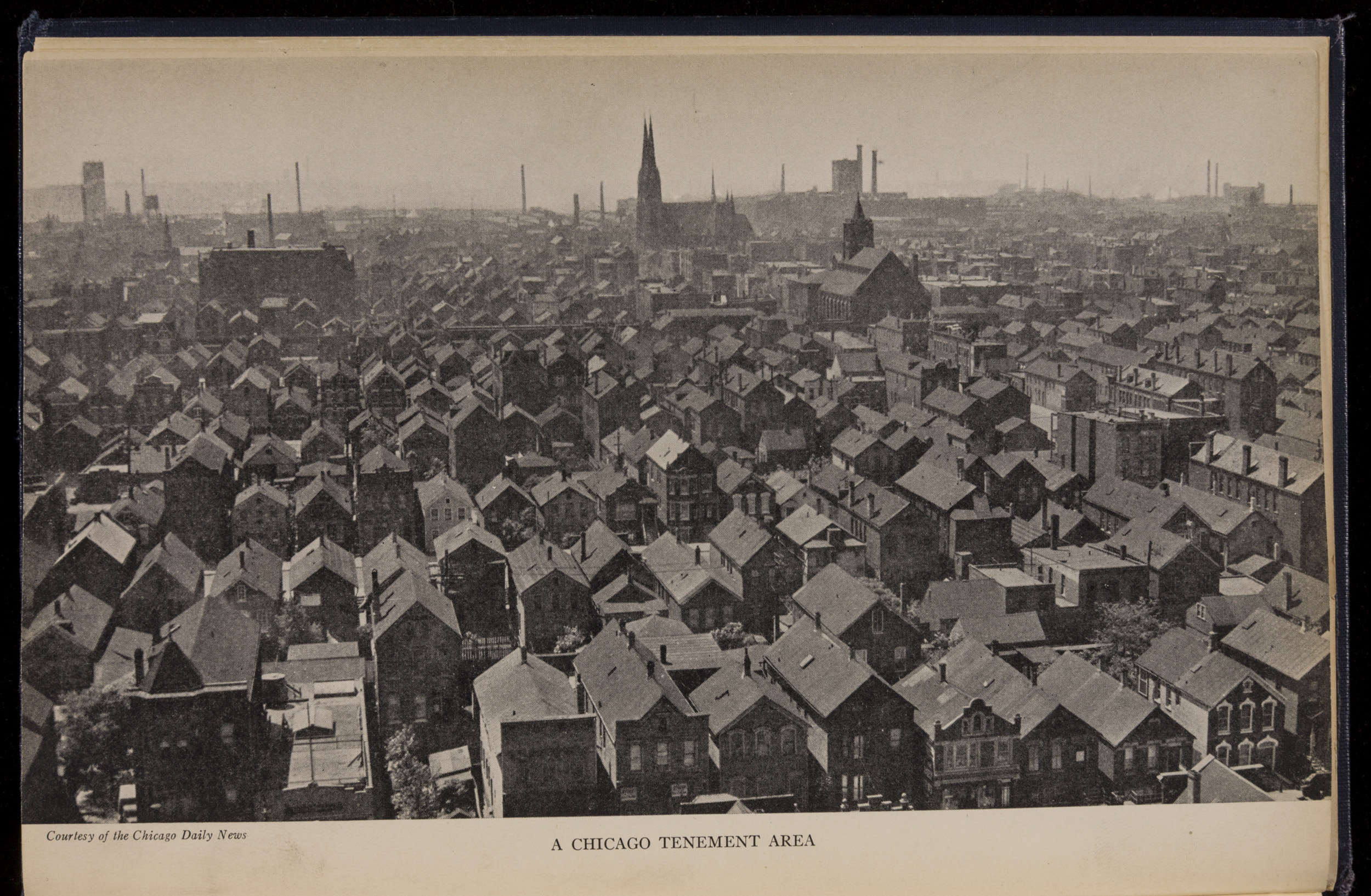
Display the image below, identifying it as a photograph of a part of Chicago in the early twentieth century. Explain that the city was facing a crisis because of overcrowding, lack of sanitation, poverty, and many other problems. For more information about the problems of Chicago and other cities at that time, see the digital Collection Essay “These Are the Women Who Saved the Cities.”
Click on the image for a high-resolution version that can be displayed for your class.

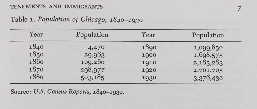
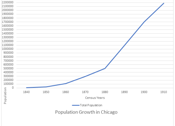
Explain to students that they are going to make a chart showing the population growth of Chicago from 1830 to 1900. You may want to work as a class or in small groups to create the chart. It will be based on a table from the book The Slum and the Ghetto: Immigrants, Blacks, and Reformers in Chicago, 1880-1930, by Thomas Lee Philpott. The table on the left page below shows the population of the city from 1840 to 1930. The period we suggest you chart is 1840 to 1910.
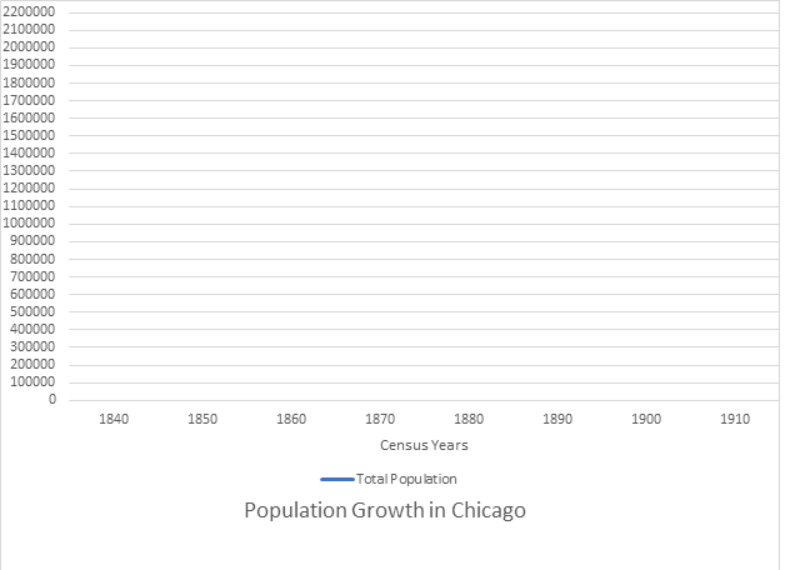
If students are new to creating graphs, explain to students that a line graph has two axes. The horizontal axis is called the x-axis and the vertical axis is called the y-axis. Where the two axes intersect is called a data point. In this chart, the vertical axis will be labeled to show numbers of people and the horizontal axis will show decades. The title of the graph will be “Population Growth in Chicago, 1830 to 1900.” This is what the empty graph could look like.
This chart was created in Microsoft Word, and Microsoft Excel has excellent graphing tools. But graph paper is easier and will work very well and will focus students’ learning on the way a graph works rather than mastering a new piece of software. Now, have students fill in the chart for total population, using numbers from the table. They will quickly discover that the population totals for the first three decades on the table don’t even make it up to the first number on the vertical axis. Have students make estimates of where the data points should go and then ask, “What can you learn from the chart so far?” (The city was small and growing at a slow but steady rate.)
Continue to fill in the data points for the total population and connect them with a colored line. The chart at this point could look like this.
(Recommended for grades 6 and up)
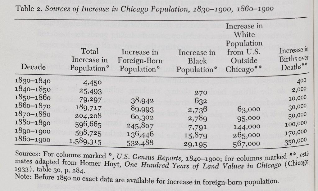
As an extension activity, looking at the table for the population increases of different groups in the table below from the same book can be interesting and thought-provoking. If you decide to chart that table, however, note that the numbers for each decade are for the increase in population, not the population itself. Explain that this is similar to acceleration rather than speed.
Download the following materials below: